Georgia Bray
Sam Thomas
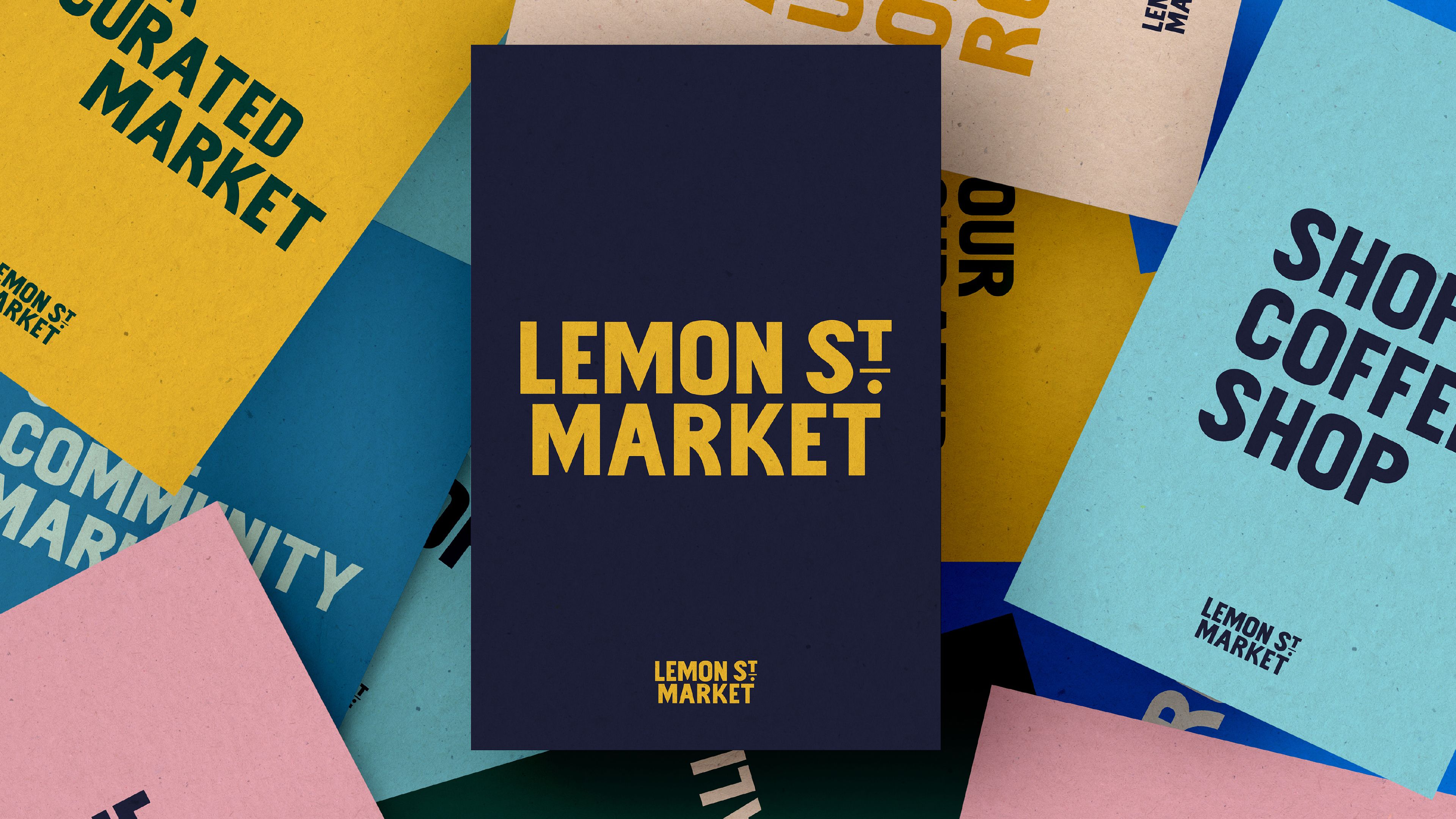
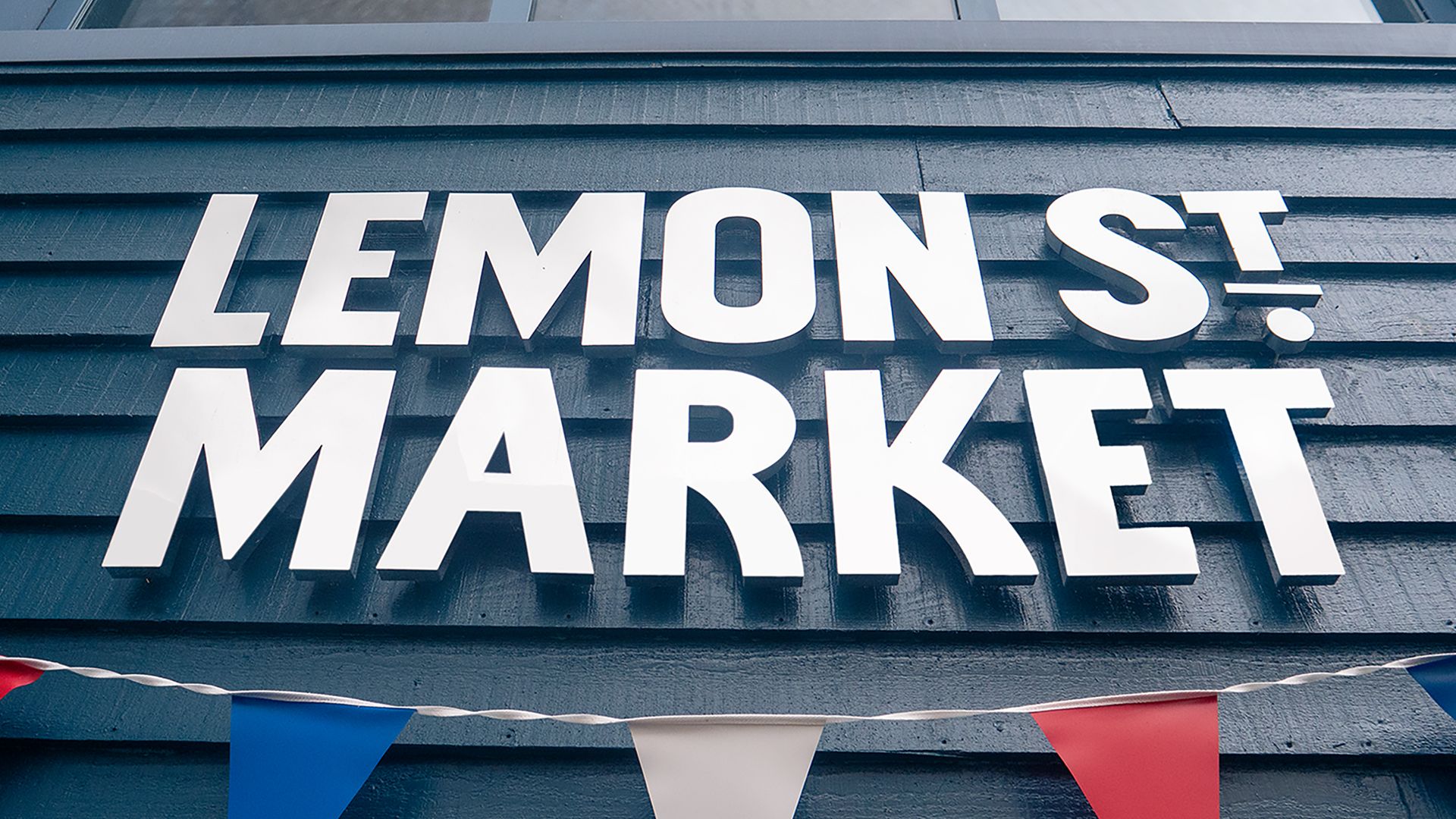
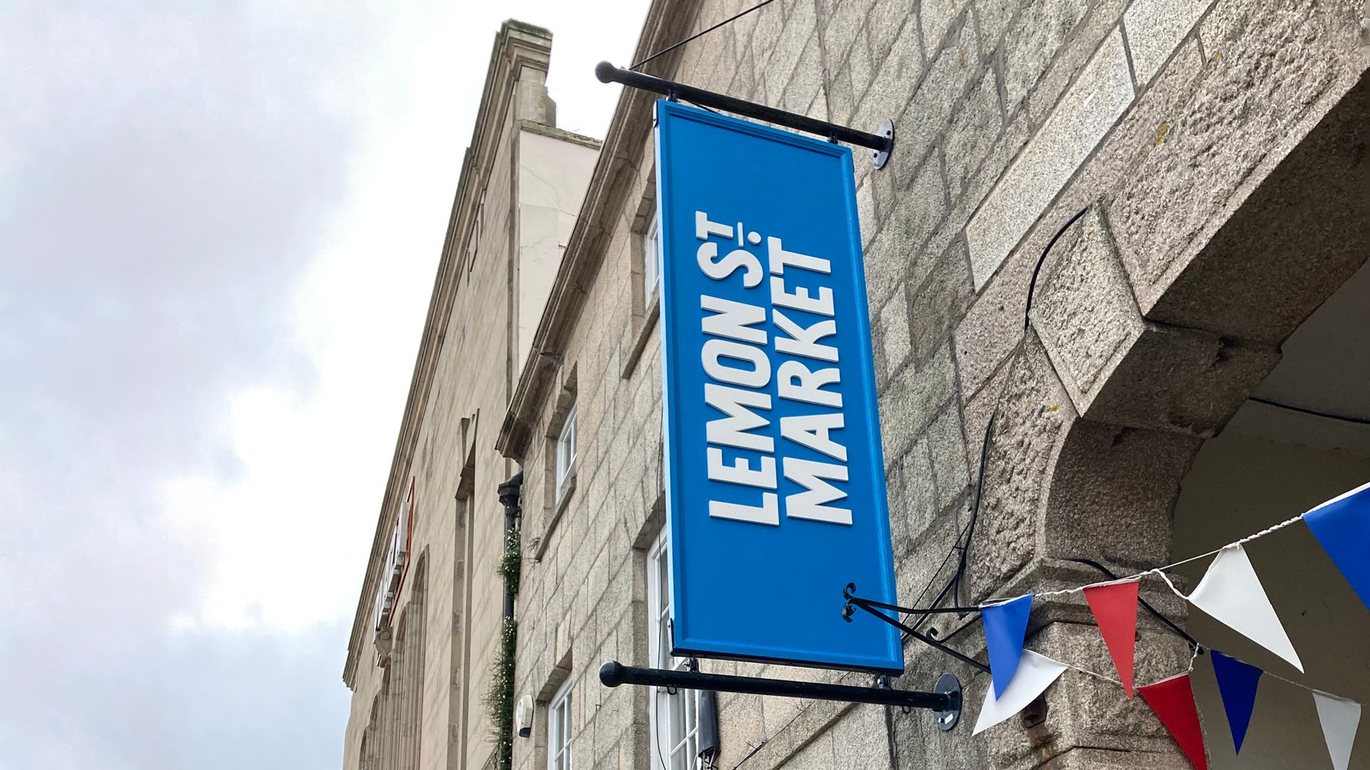
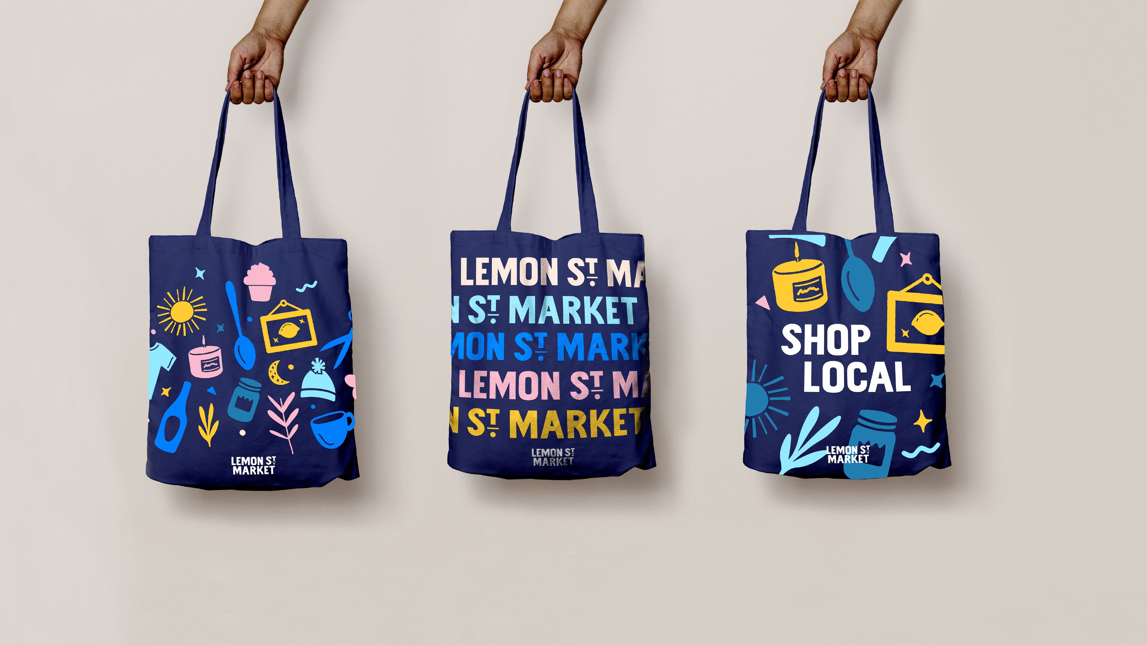
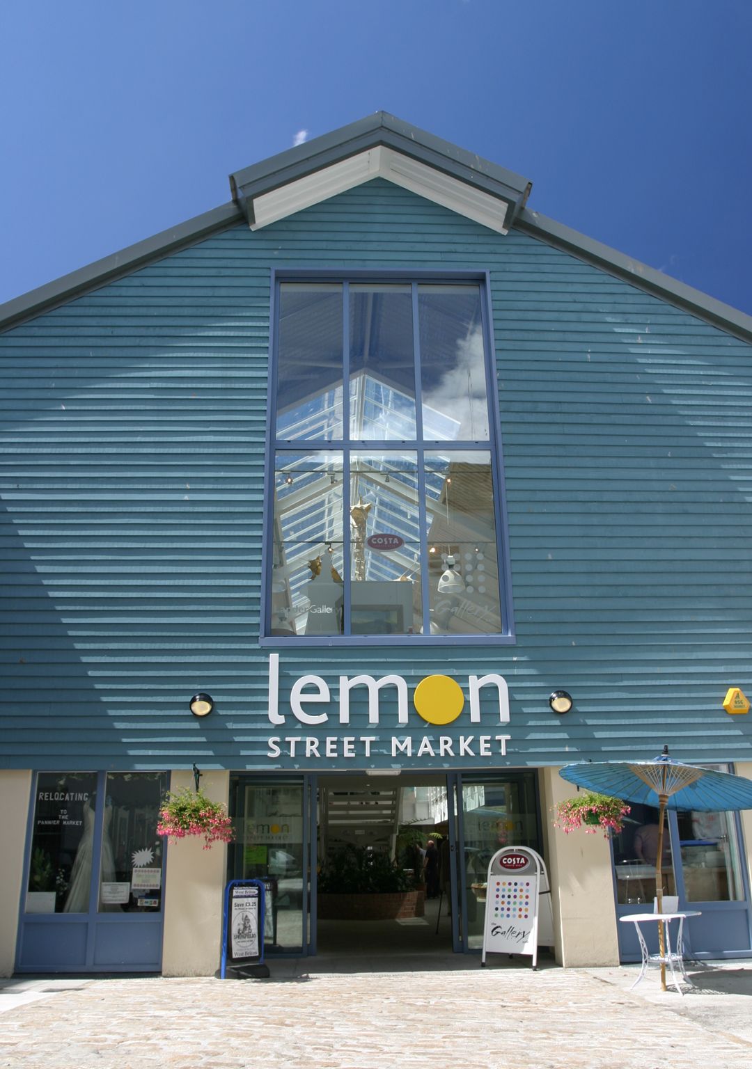
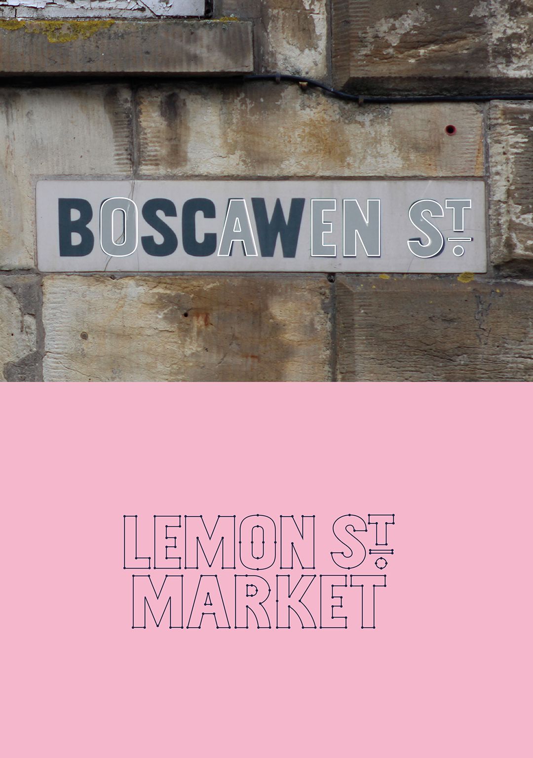
An identity that's intrinsically connected to the city
Creating a type mark brand solution for a prominent retail location who's history is intrinsically connected to trade and commerce of a celebrated city.
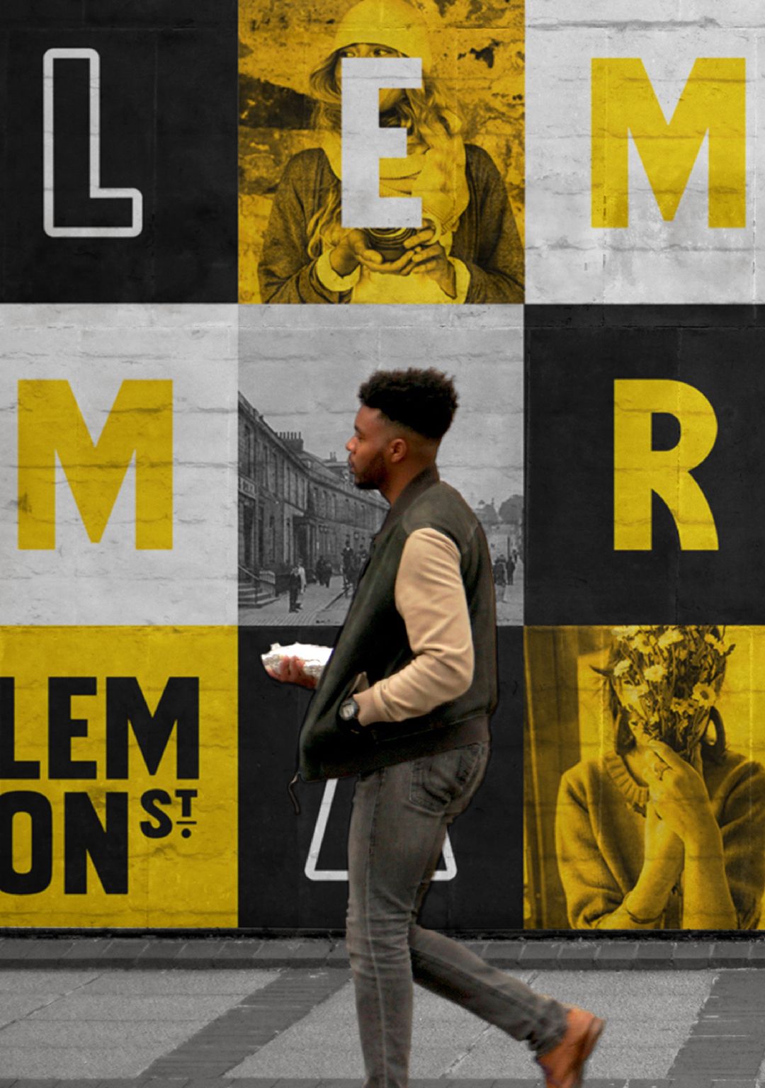
The mark's simplicity ensures versatility and recognition, fostering a sense of pride and identity rooted in the city's history.
Challenge
The challenge was to tell the story of the market by celebrating it's connection to the city and celebrating it's role in supporting it as the centre of commerce
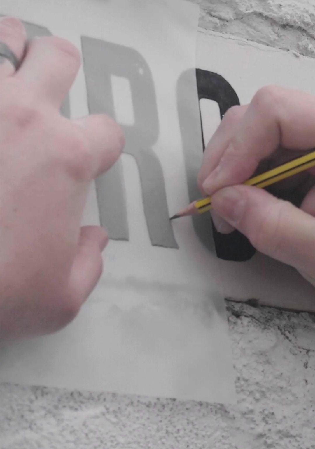
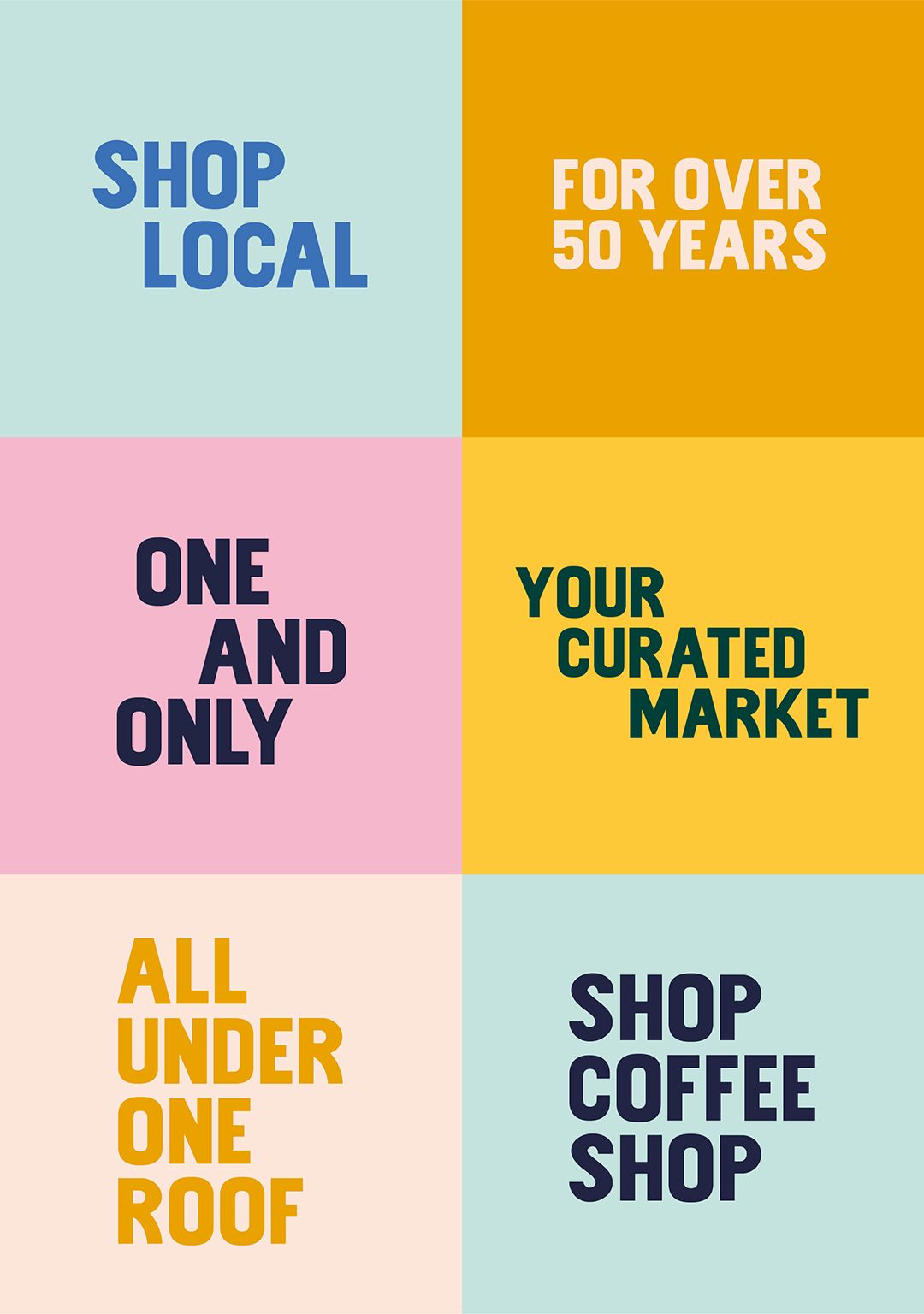
Process
We wanted to develop a solution that was intrinsically connected to the fabric of the city. By using historical wayfinding from the late 1800's we were able to develop a unique brand typemark
"We want brands to tell stories, to surface the history, the lore, and the personality that can shape a concept to connect with the people that use it the most. Emotional connections are built on more than just pretty visuals, and the need to create something that resonates with your audience has never been more important."
Sam Thomas, Creative Director
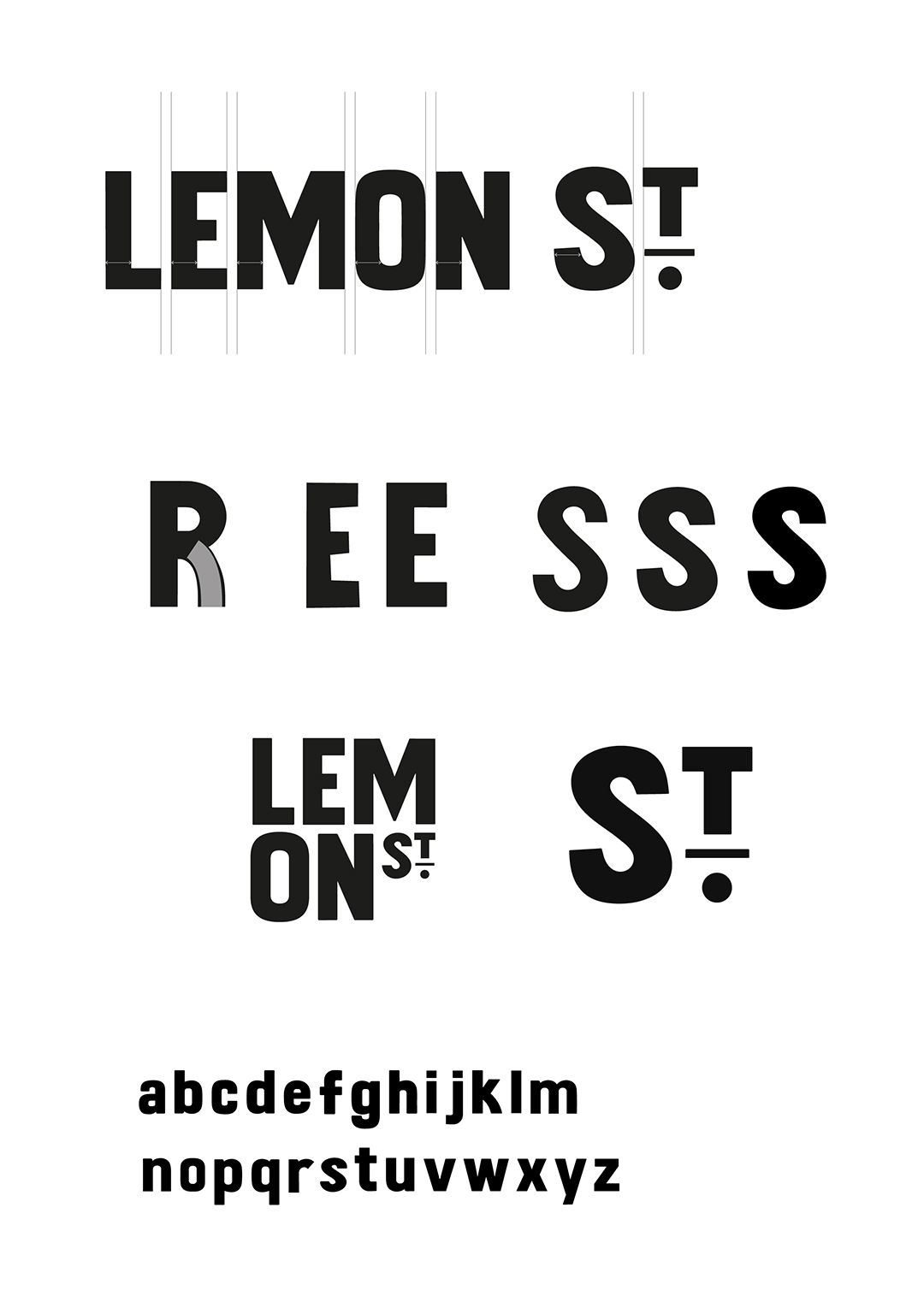
"We always wanted the type to be more than just a display type solution, and develop it as a fully functioning and useable typeface. This meant paying more attention to the relationship of each letter, and developing a full glyph set to work alongside both upper and lowercase variations.”
Jacob Beckett, Executive Creative Director
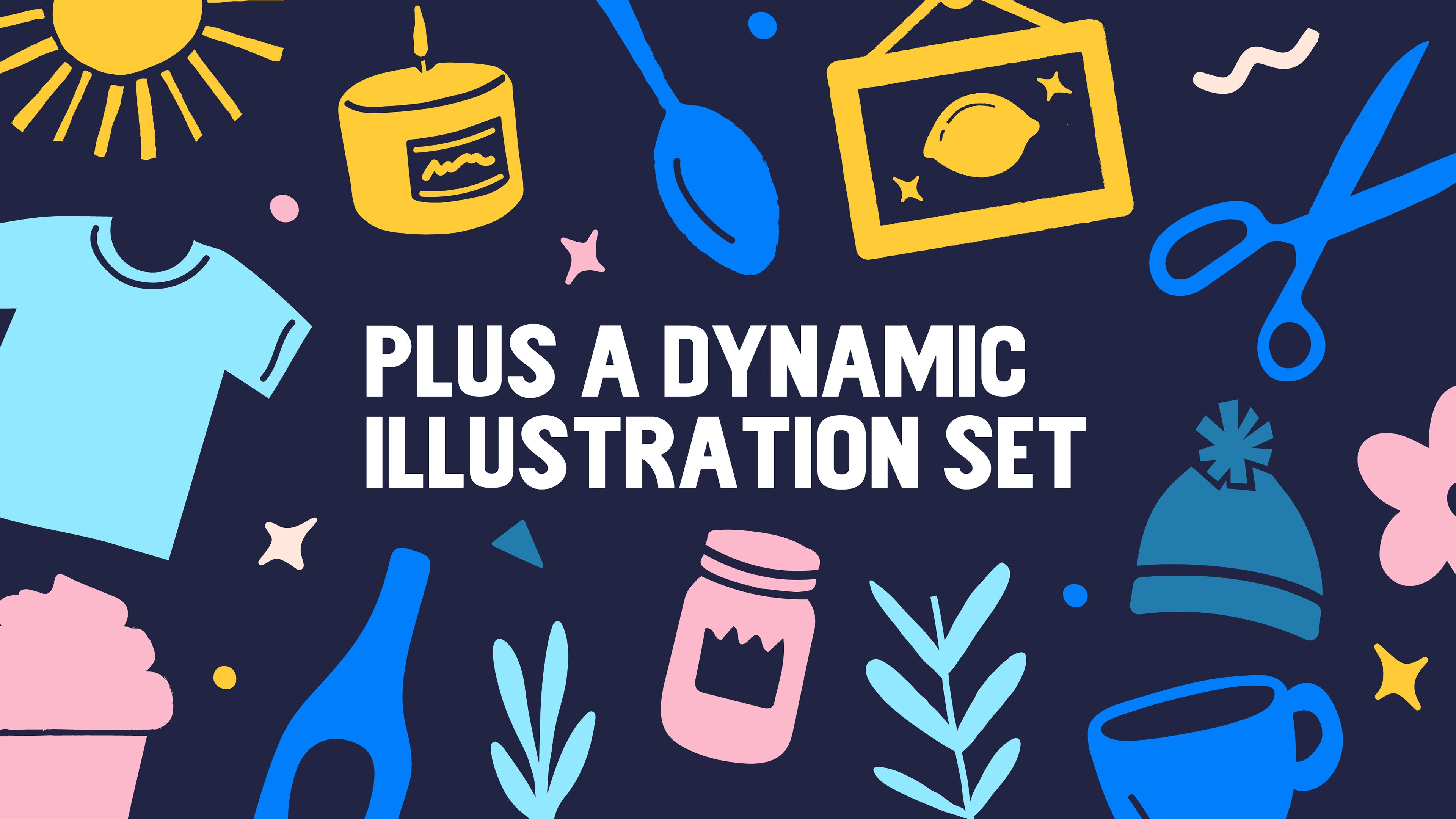
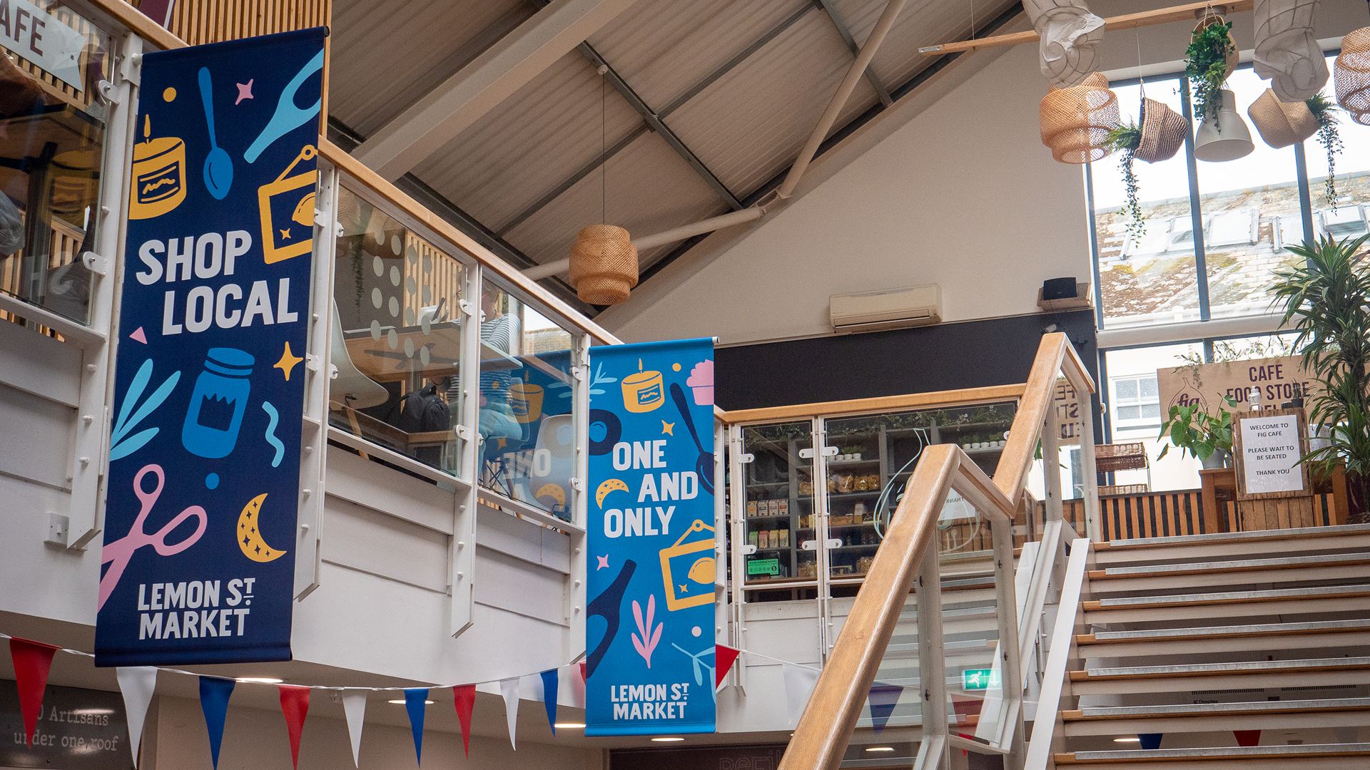
Solution